Can’t speak to the orders side of your business (yet ![]() ) but the site and forum are both very high quality. I agree with Azflyer’s comment though about creating more permanent reference material on the site. All the information is there for those that enjoy digging for it but I think many more visitors would hang around longer and become more involved if some of the more general RFID knowledge had higher visibility.
) but the site and forum are both very high quality. I agree with Azflyer’s comment though about creating more permanent reference material on the site. All the information is there for those that enjoy digging for it but I think many more visitors would hang around longer and become more involved if some of the more general RFID knowledge had higher visibility.
3 Likes
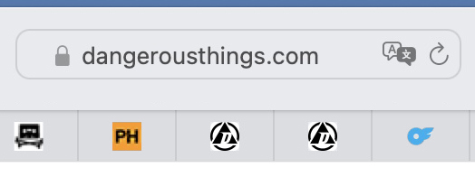
OK this is a minuscule website enhancement request for your consideration: Could you make a difference between the favicons from the DT site and the DT forum? A difference in colour maybe? That way when I am slaving away at my computer (see below) and I want to jump to the forum without using trial and error, I can.
Good point!
1 Like
Now I’m searching for Amal g on OF
3 Likes
ok what do you think?
2 Likes
Perhaps a white background behind it for dark-mode friendliness? (Please ![]() )
)
3 Likes
I really like the talk bubble idea but making it oblong reduces the DT icon a little too much (to my eye) and I find it harder to read. How about squaring it up a little…

1 Like
What about using this logo with “forums” inside the black bar? I believe that was done with the home assistant project but with “community”

the problem is that a favicon is only like 64x64 pixels so there is only so much you can put in there and have it recognizable.
2 Likes
Ah good point
Actually it’s a lot worse than that: favicons are only 16 x 16 pixels. Only the simplest images survive!
2 Likes
It’s black and white. Kiss principle. Invert the colors on one of them.
1 Like
That only means you can tell them apart. The speech bubble tells which is which at a glance. Hiss principle.
2 Likes