Rework of the mark sticker I made. Tbh I don’t think this is a good final submission but I’m gonna need feedback on what I should fix.
If I’m looking at that from a distance there’s no way I’d be able to make out the implant. You’d have to give up on keeping the scale of the implant mostly accurate, but I would recommend making the implant a lot bigger.
Perhaps zoom in on P0, just enough that you can still see the outline of the hand, like:
(pre-school level drawing incoming…)
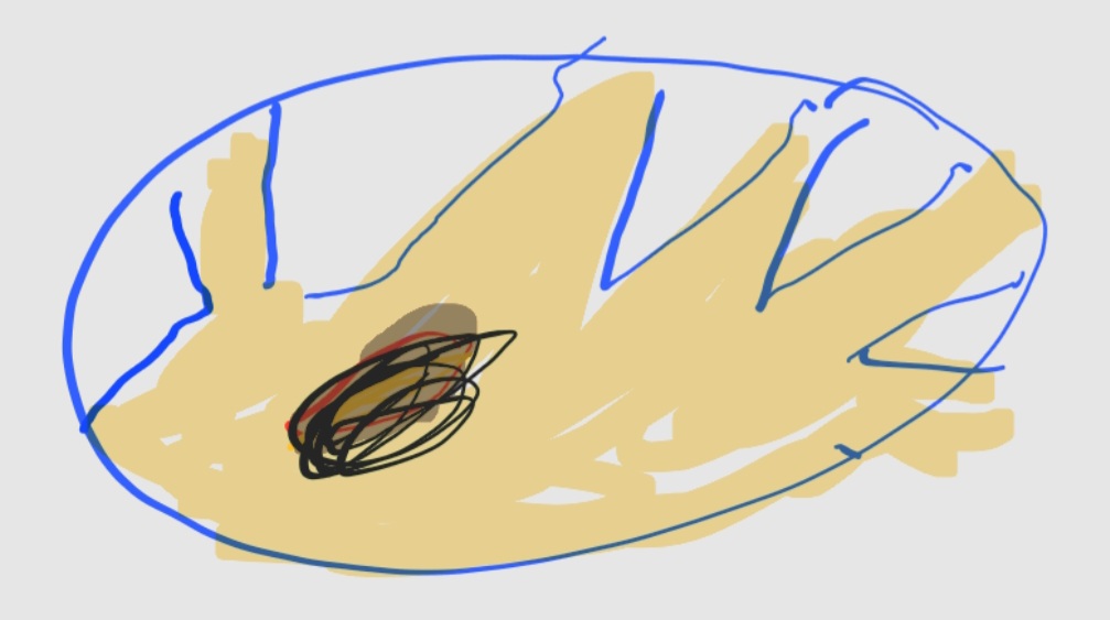
This
I think if there were to be a sticker contest it would have to be a new thread with final submissions cuz these stickers have definitely gotten much better from suggestions from other forum members.
Yeah, that’s better.
Could work. Just needs an outline and/or drop shadow maybe.
I’ve dabbled in graphic design before.
A subtle gradient in the background might do some magic too. I’m digging the tropical/sunset vibes.
Sorry, something in your sticker tringgered something in my mind and I had to take it to the meme extreme.
U should add a “glass version?” in there too cuz I know I’m not the only one begging for glass vivokey products
I gotchu.
Ive always been a fan of minimalist industrial design. Maybe something using the actual patents?
How’s this?